Build
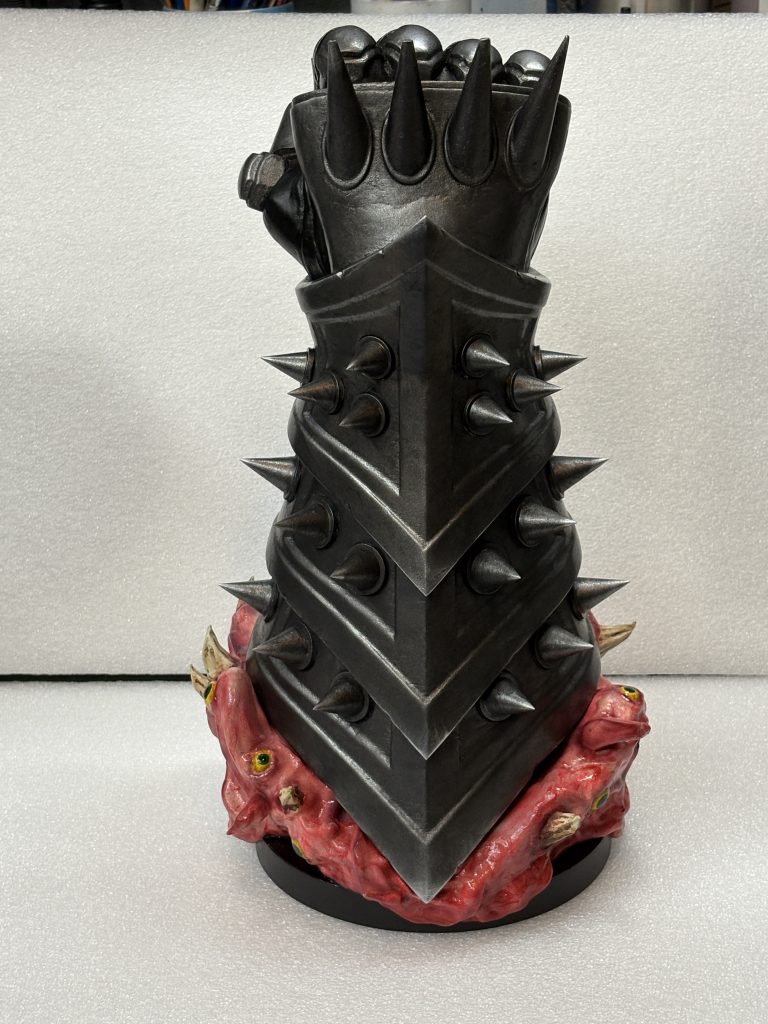
I’ve read all of the Dungeon Crawler Carl books and thoroughly enjoyed them! Then the news came out that it was going to be turned into a TV series and I was VERY happy and remain interested to see how they deliver that. Then Steve at SKS Props made this model and making it became job no. 1!
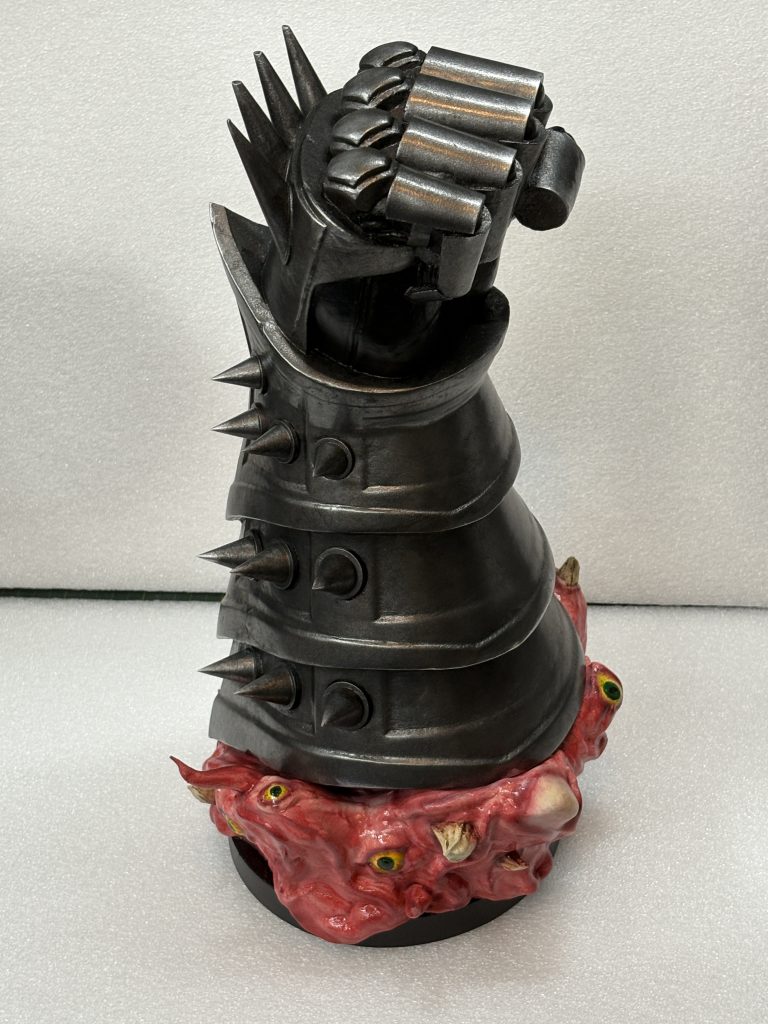
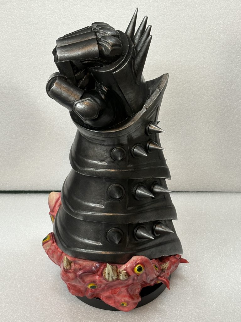
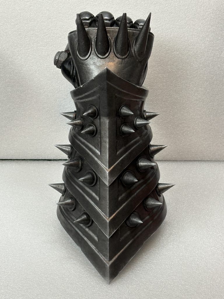
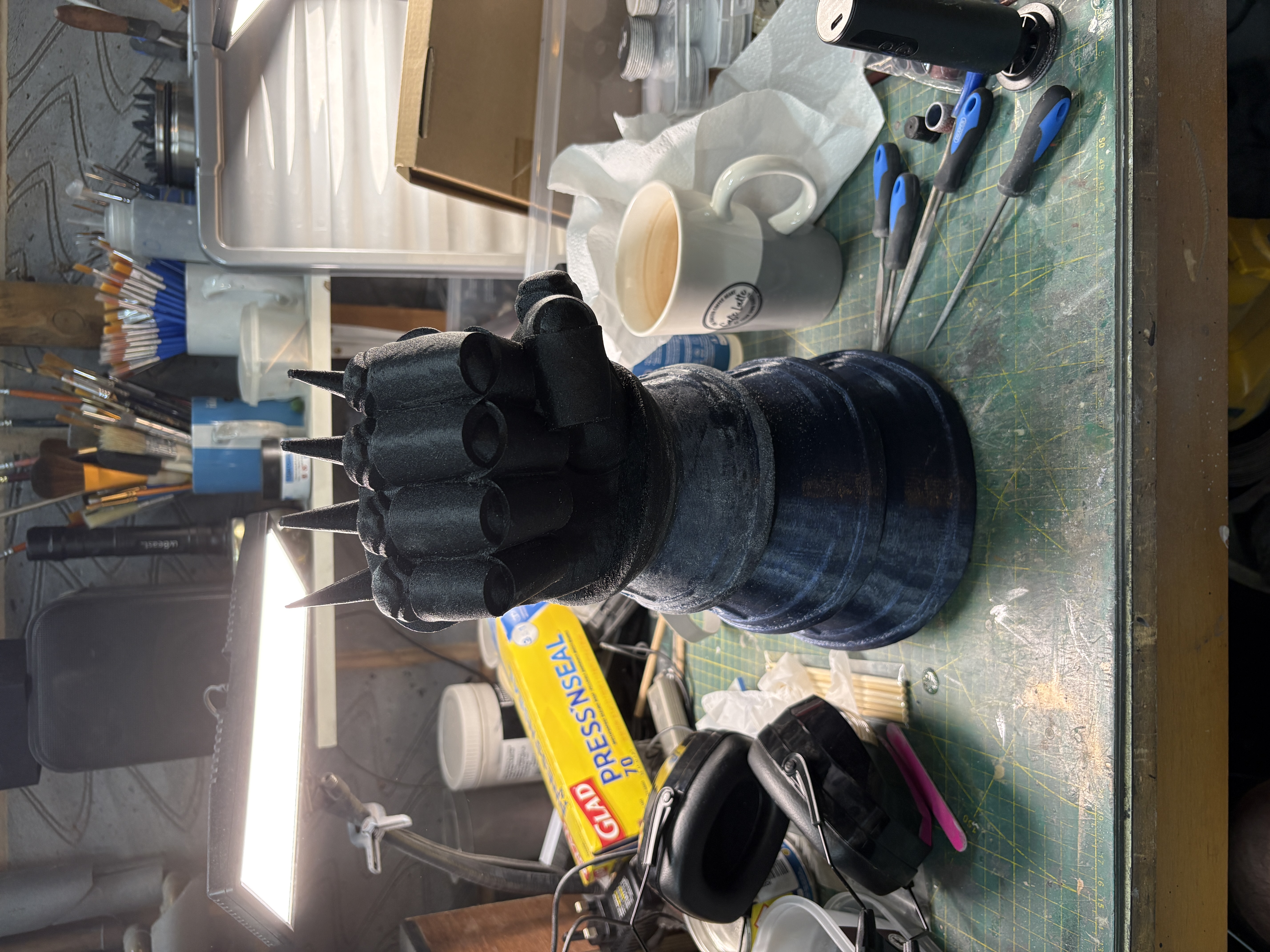
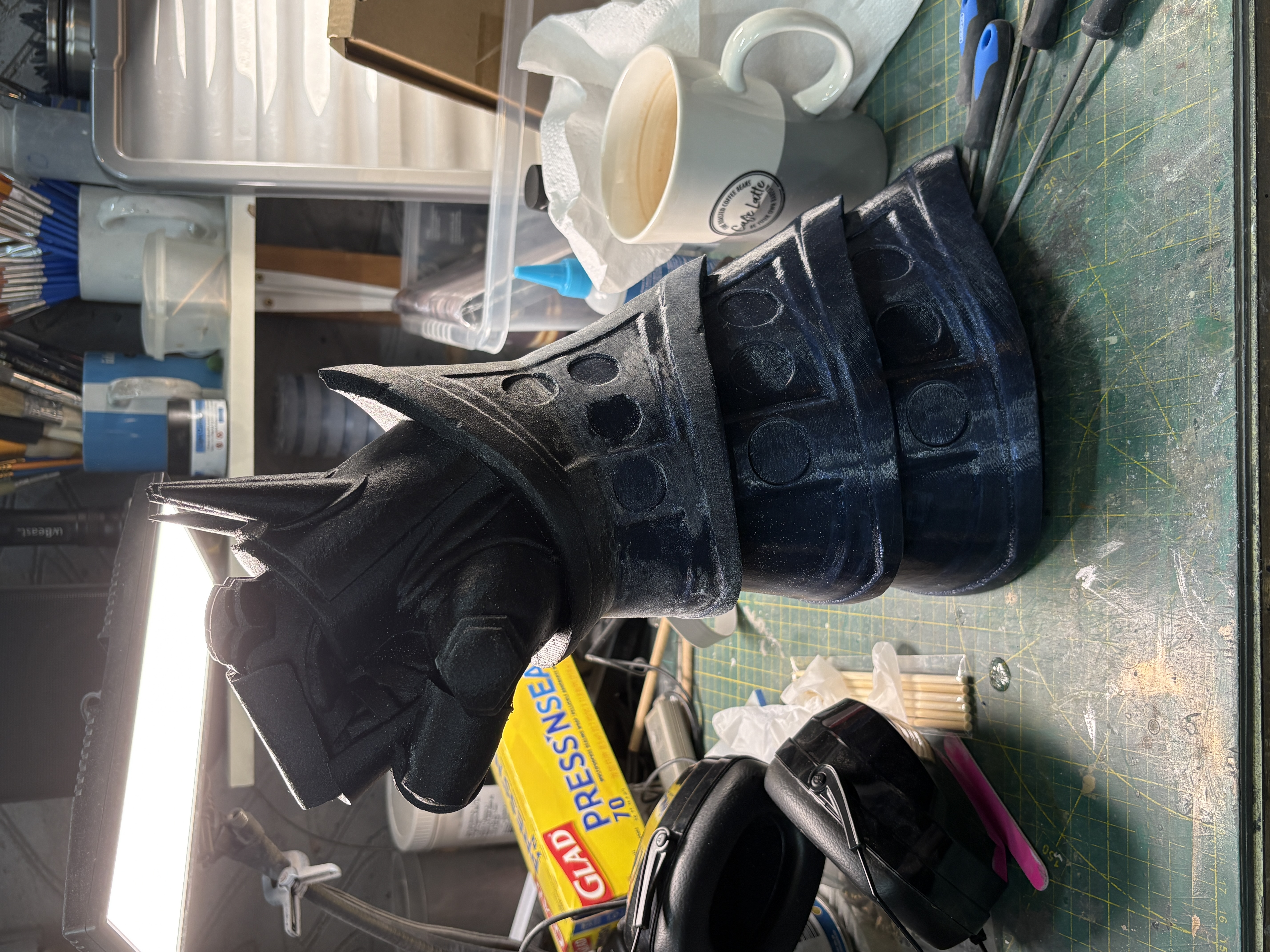
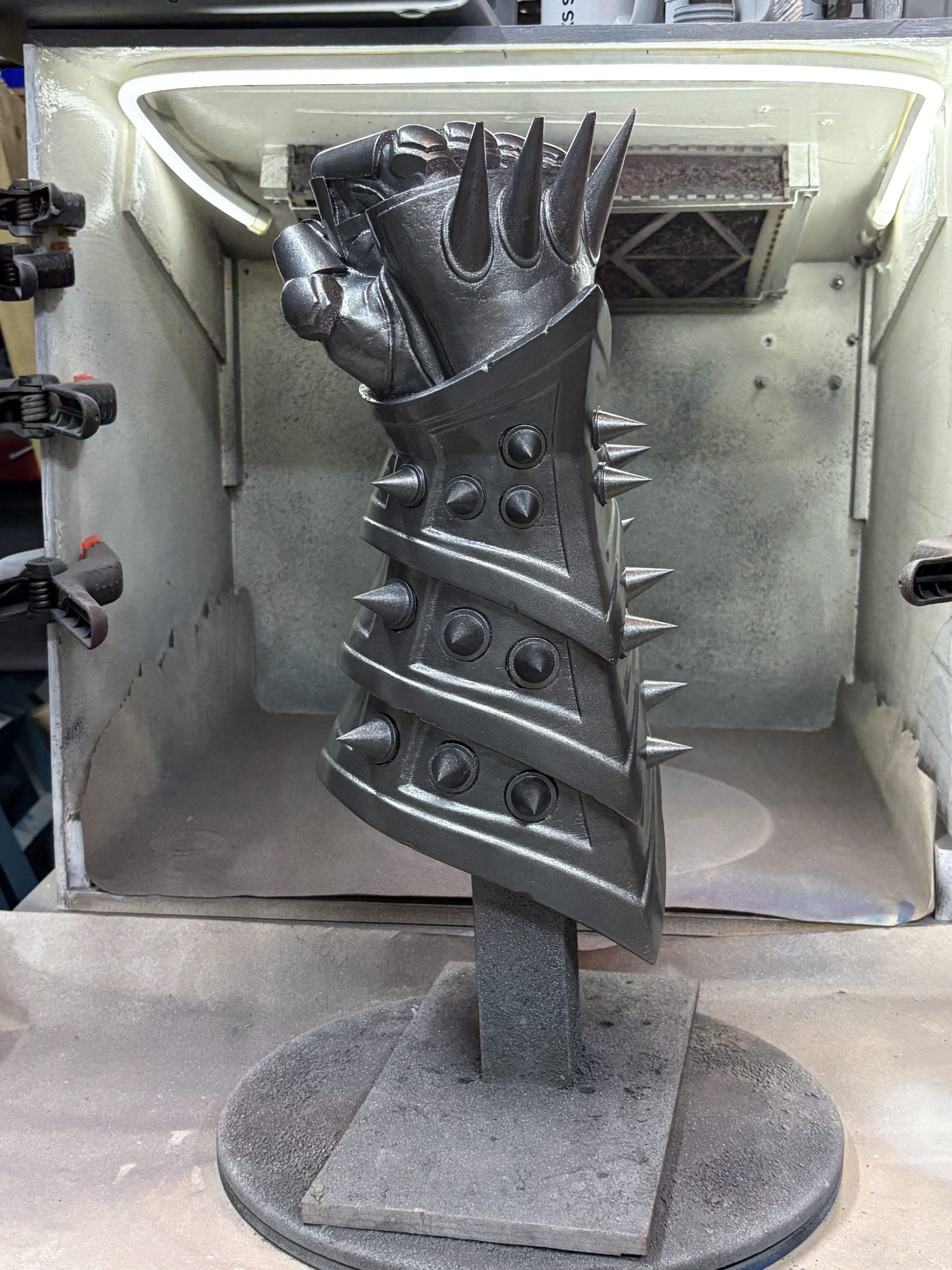
The gauntlet was printed in 2 peices, sliced at the wrist and then just glued back togther. Getting the supports out of the fist part was a bit of a challenge but that might have been my choice of filament. I had a roll of PETG-GF in the machine and just finished that off! Alignment and glueing was really easy and I filled the slight seam gap with CA glue. Spikes were done on the resin printer and glued on after flattening the bases to fit. Simples.
The base is a single print and was zero challenge!
Finish
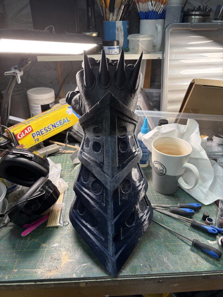
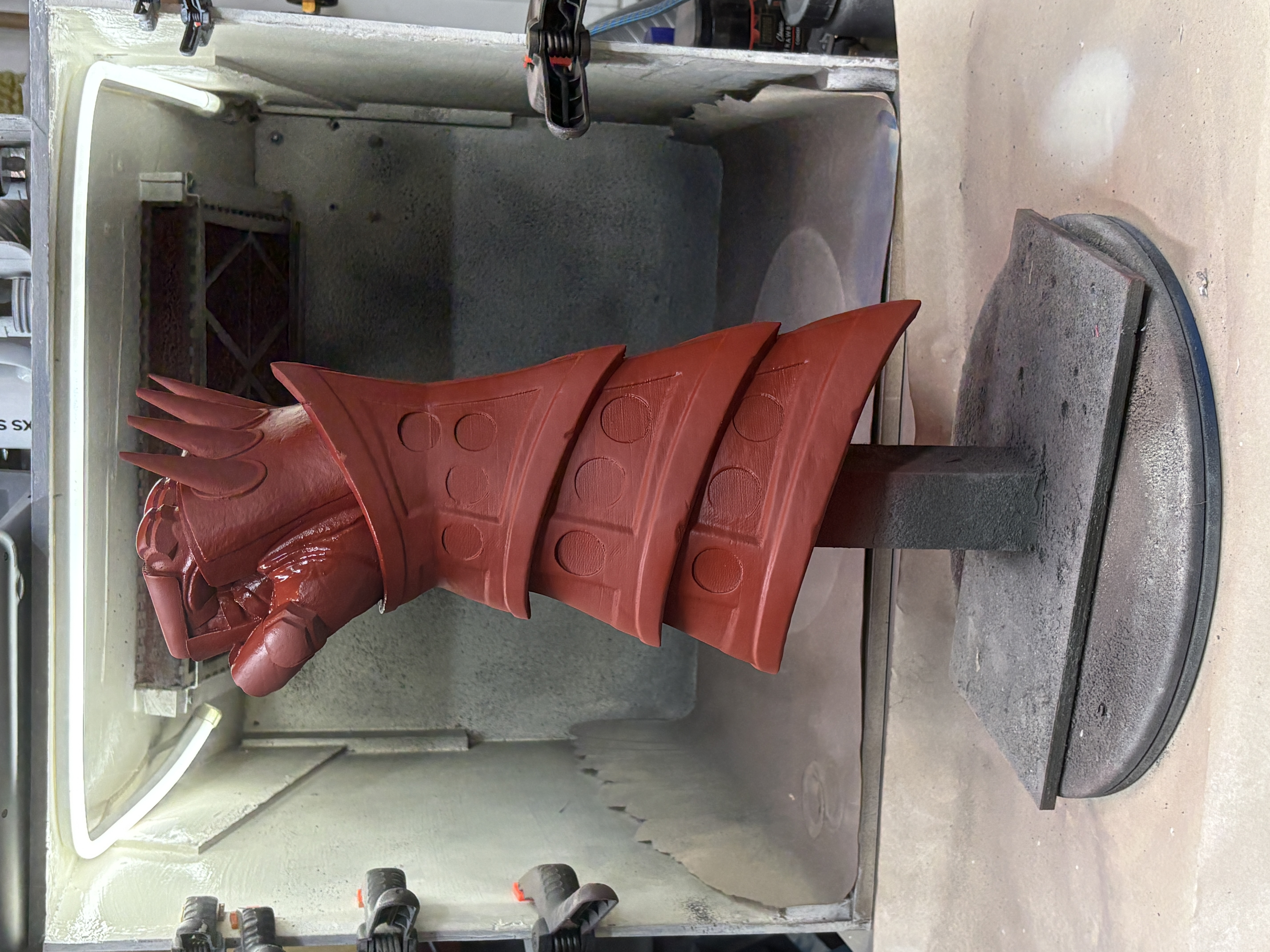
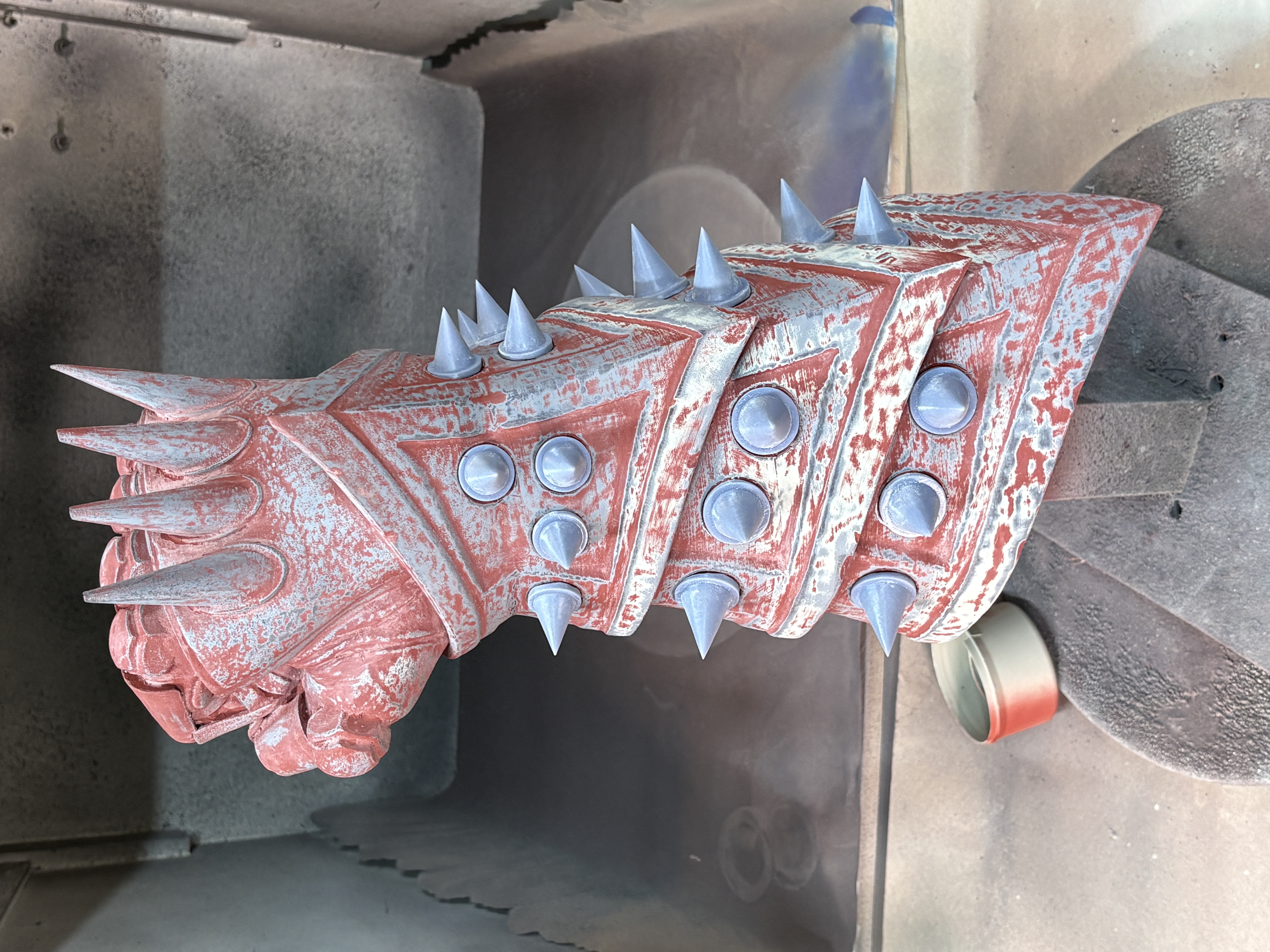
The results of the prints for the gauntlet were pretty good and only needed a bit of initial sanding before the usual filler primer / sand / prime / sand routine. I made the decision to do a final wet sand (which I don’t usually do) to see what difference that would make to the final finish as this was supposed to be made of big peices of metal. The red oxide primer gave me a really good marker for where there were significant, unwanted low spots and the final result at 600-grit was about what I wanted! 4-stars, would try again! (lost 1 star becuse it IS messy!).
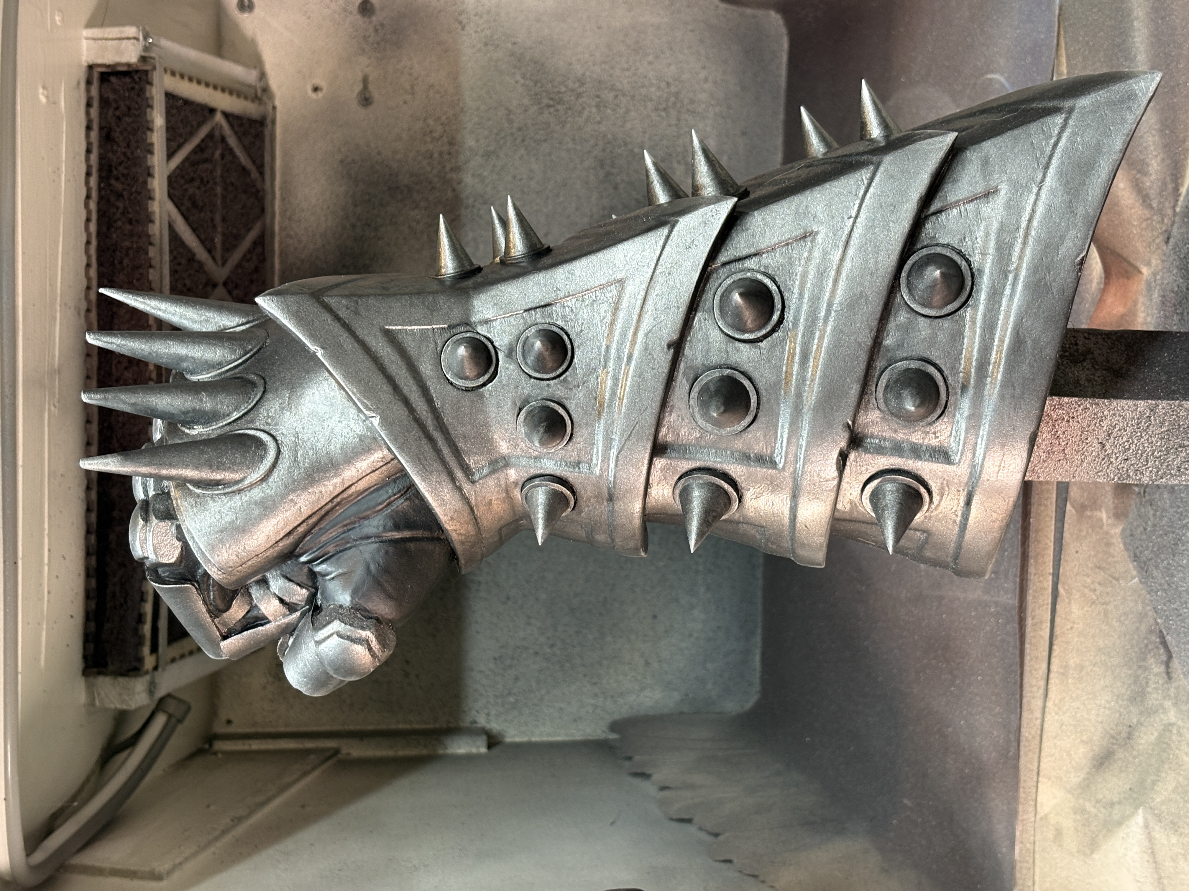
Paint on the gauntlet was just prime, knock back, 2 coats of metallic gunmetal and then black was splashed on and blotted. I tried Steve’s approach of using graphite powder for the metalic finish but the results I got were a little too uniform for the look I was after – yes looks like metal for sure, but just a bit too clean for me! The glove areas were just painted black, job done.
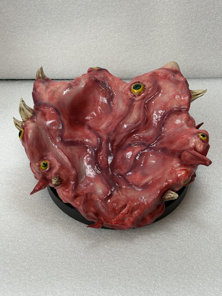
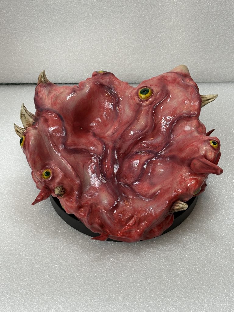
The base was where my challenge sat. I wanted this to look…. fleshy. Pretty much everything I’ve made so far has been hard-edged, functional and equipment-like so absolutley nothing like this at all!
First step, surface finish. The main bulk of the base needs to be smooth, not metal smooth though; flesh smooth. And then there are the teeth and tentacles, both sticking out but different in consistency, oh and the eyes, they need to be eye-ish and finally it needed to be…. well it needed to look moist!
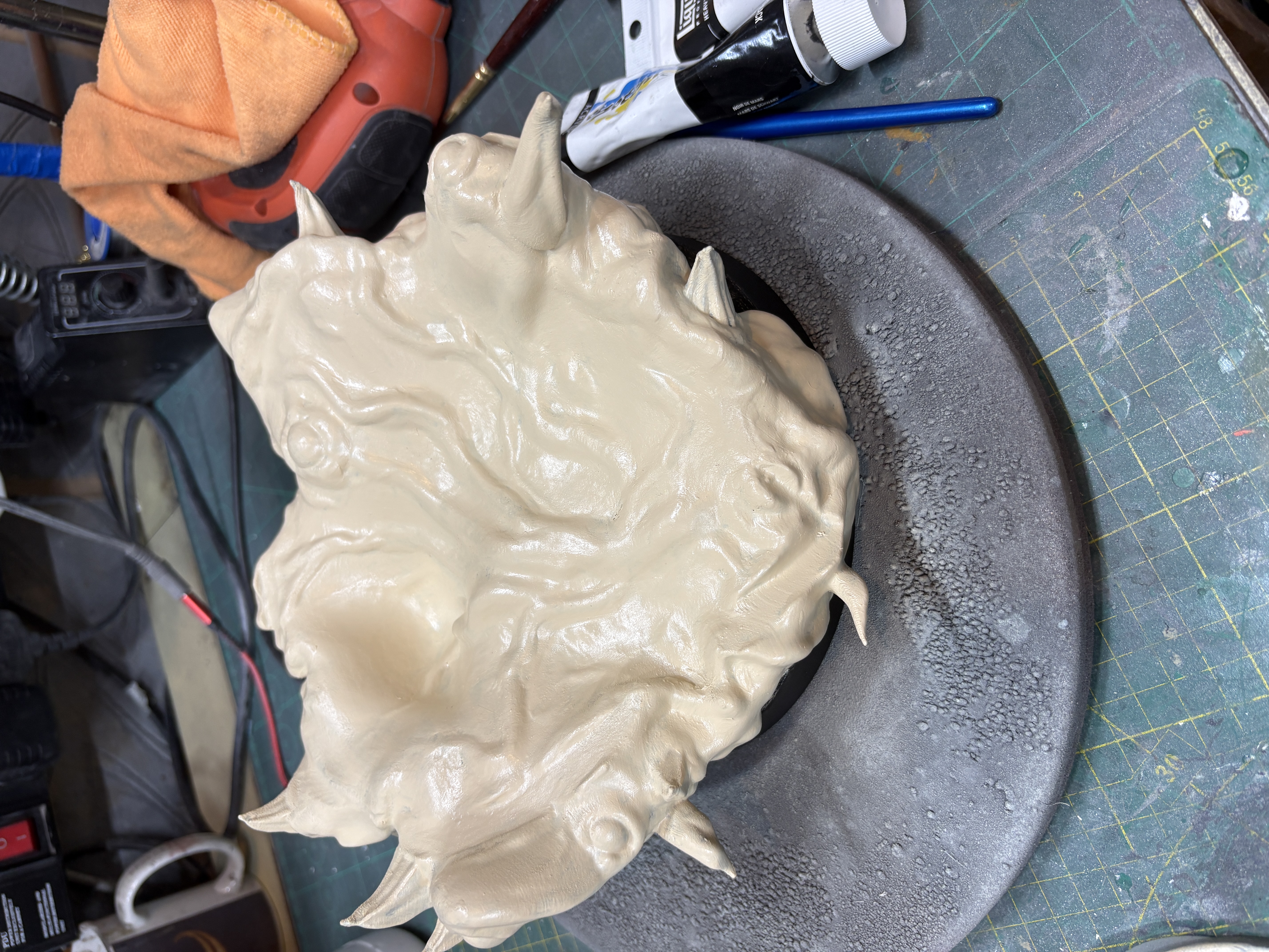
Smoothing – acrylic filler thinned with some water and wiped over everywhere on the top surface. This was a pain to sand initially and I almost wished I’d not done it, but I was able to correct the layer-lines and add in some natural bumps and ridges. Then filler and sand to see my problem areas – luckilly not very many. Then spray putty, sanded back and re-applied.
Spray putty is great at covering layer lines, but a little soft so does need to be used with care and not allowed to build too deeply. Then filler-primer / sand primer etc etc until bored.
Now. Flesh tones. Note here, these are flesh tones, NOT skin tones – my other half was a little taken aback upon seeing the results of my efforts!
Flesh is pinky red, sort of, with reddish-blue elements and the occasional lighter bit showing through where stretched over boney stuctures underneath (I may have overthought this a little!).
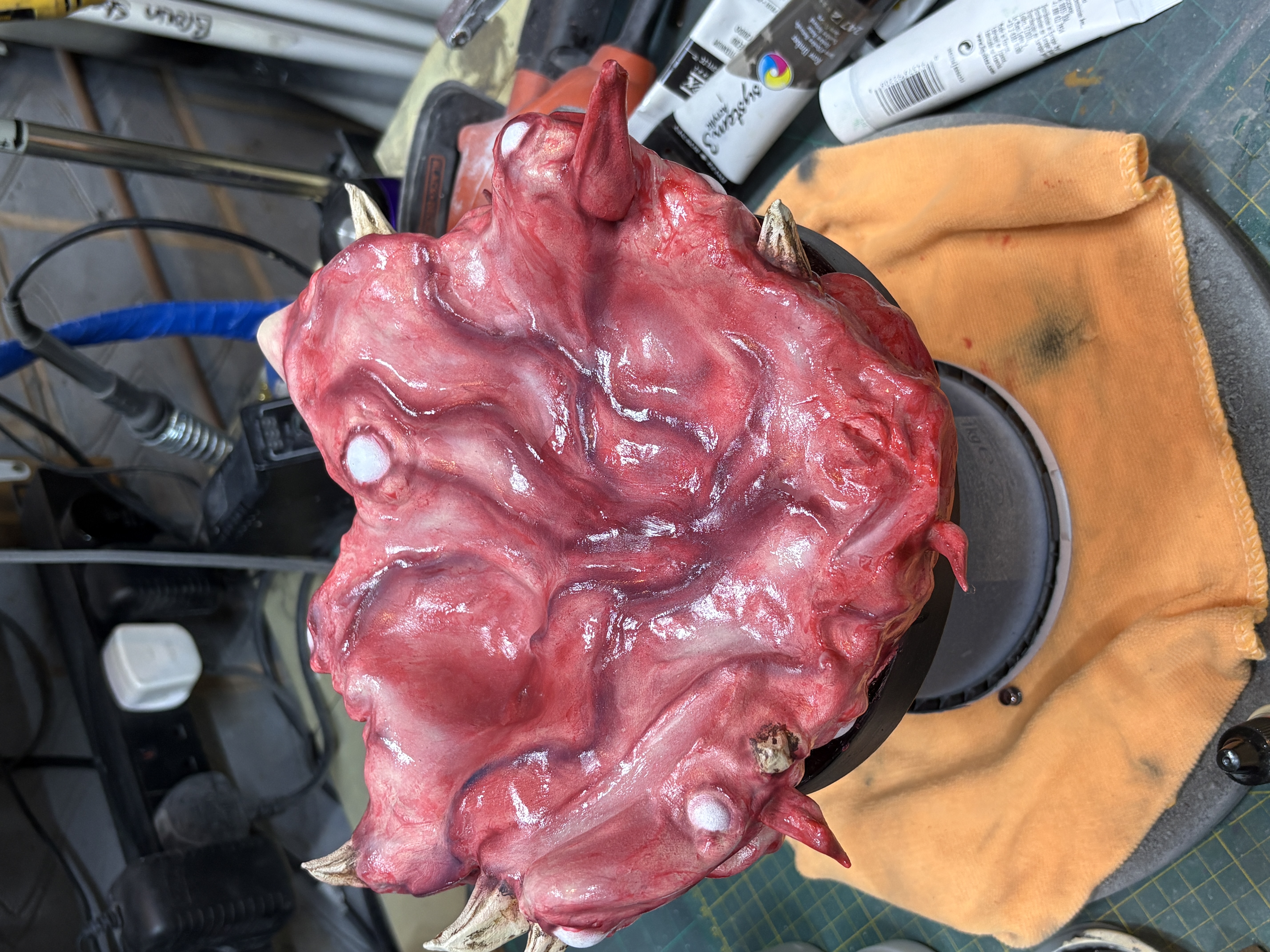
First coat was a boney tone of parchment acrylic brushed on. Then I used a gloss clear acrylic medium with a small amount of transparent red acrylic paint mixed in and smeared that over everything… with my finger.
I found that using a sponge gave me a speckled finish and brushing produced lines, my finger allowed me to smear the medium on and sort of drag it around. Where the surface had started drying this caused natural looking ripples and lumps which were darker because they got thicker. Good so far!
Veins, I wanted the central raised elements to be veins just under the surface and so they needed to LOOk under the surface! The colour was a blue and red mix of airbrush paint with some flow improver mixed in to thin out the pigments a bit, then I just wafted at a low flow rate along all of the ridges I wanted to be veins and let the overspray start to define the falloff.
Then more transparent goop over the top and the look was starting to come together BUT… it was looking a bit uniform, a bit samey, a bit.. pink. Time to show bone!
A bit of bone airbrush paint very lightly applied into the flatter areas and across the ridges where the flesh would be pulled tighter gave the levels of contrast I wanted. Finally I airbrushed some shadow tones and contrast areas with a more purple hue around the base of the teeth and tentacles.
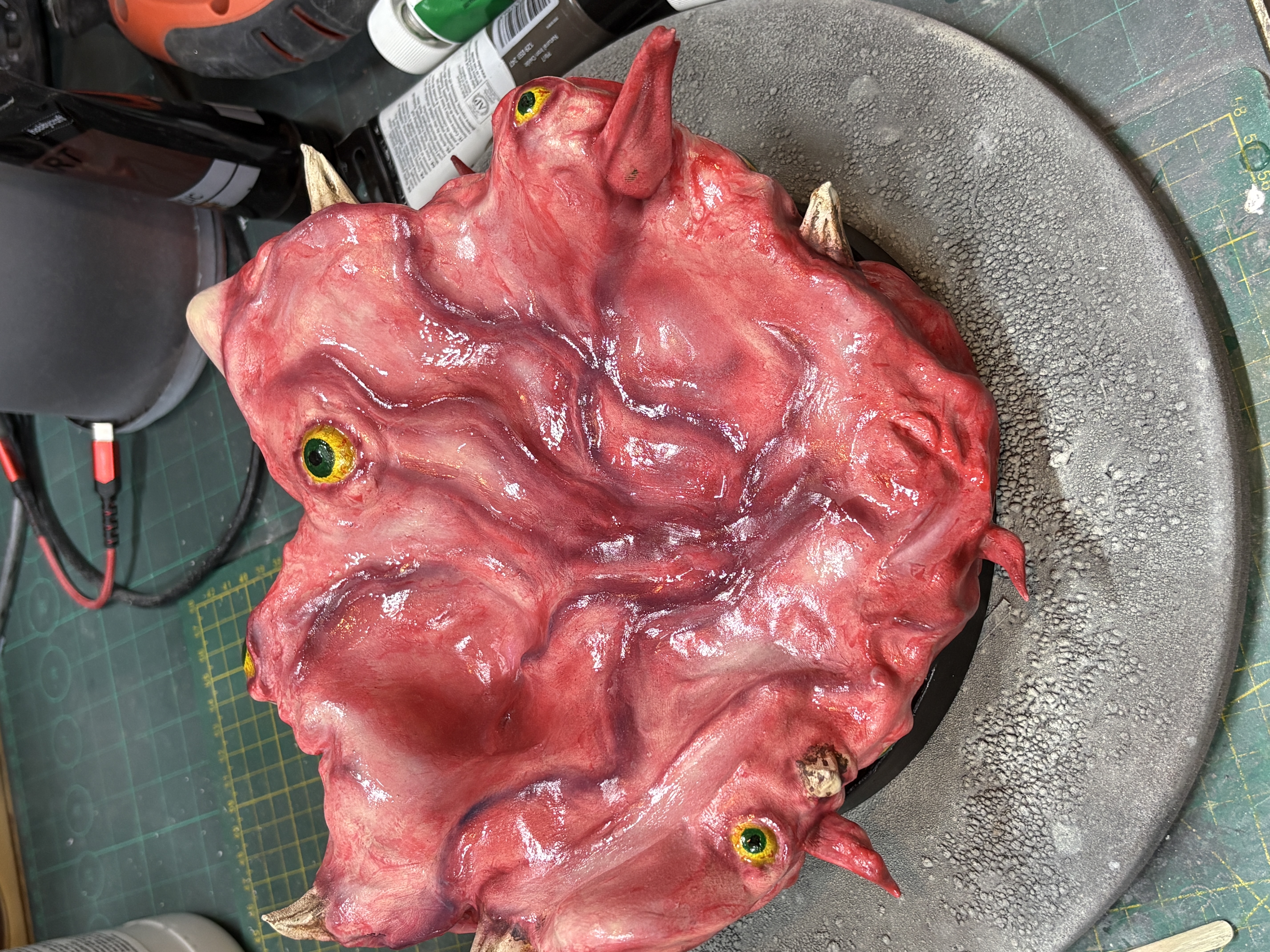
The teeth were layers of the parchment base a touch of unbleached titanium and some decay build up of raw and burnt umber. I deliberately left the teeth ‘dry’ too, to give a bit more contrast.
Eyes were a yellow-green base (only roughly mixed to give me some slight variance), with the iris and pupils just simply painted in. They then got their very own coating of gloss medium with no pigments added to give more moisture.
Materials
- PET-G filament
- ABS-like resin
- Heavy arcylic sculpting medum as filler
- CA glue
- Spray putty
- Grey filler primer
- Metalic gunmetal spray
- Silver Rub’n’Buff
- Transparent red acrylic paint
- Purple acrylic paint
- Clear gloss acrylic medium
- Black acrylic paint
- Yelow, green, raw umber and burnt umber acrylics
- Red and blue airbrush paint
- Airbrush flow improver
- 80 / 120 / 200 / 400 / 600 sandpaper and sticks
Tools
- Anycubic Kobra 2 Max FDM Printer
- Crality K2 Pro FDM printer
- Anycubic Mono 5s resin printer
- Airbrush
- Craft knives
- Various brushes